
Context Heading
Life Cycle Assessment helps organisations understand environmental impact across a product’s lifecycle. Working with that information involves detailed models, interconnected supply chains and multiple impact categories.
Earthster brings these elements together in a web application for exploring and analysing environmental data.
Challenge Heading
Earthster needed to handle large volumes of technical information without making the experience inaccessible.
The challenge was to help people understand, navigate and use complex lifecycle models with confidence, while preserving the depth and rigour expected from professional LCA software.
Insight & Strategy Heading
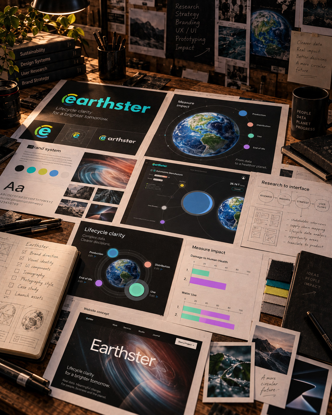
We approached Earthster as both a brand and a digital product, considering the wider system rather than treating interface design in isolation.
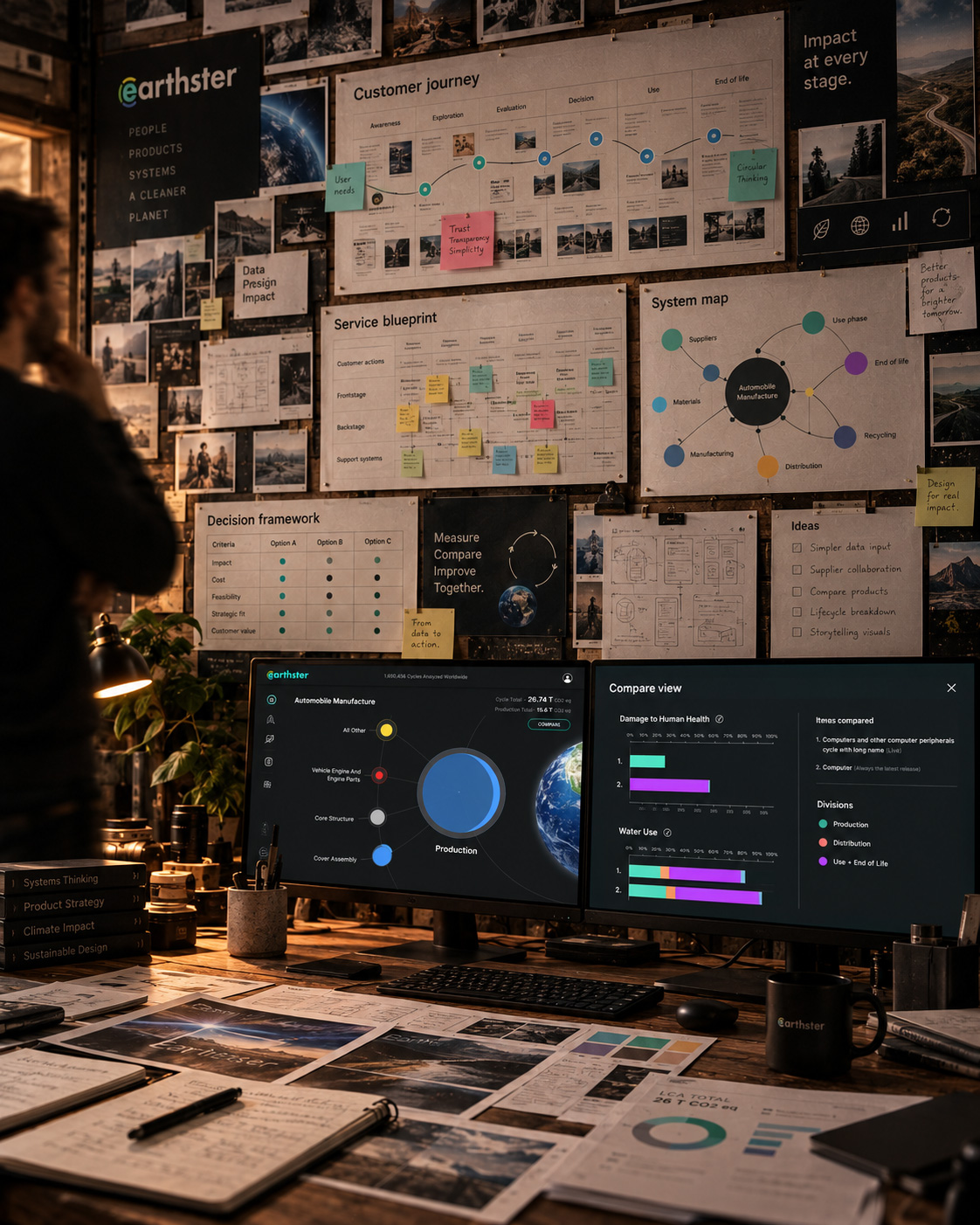
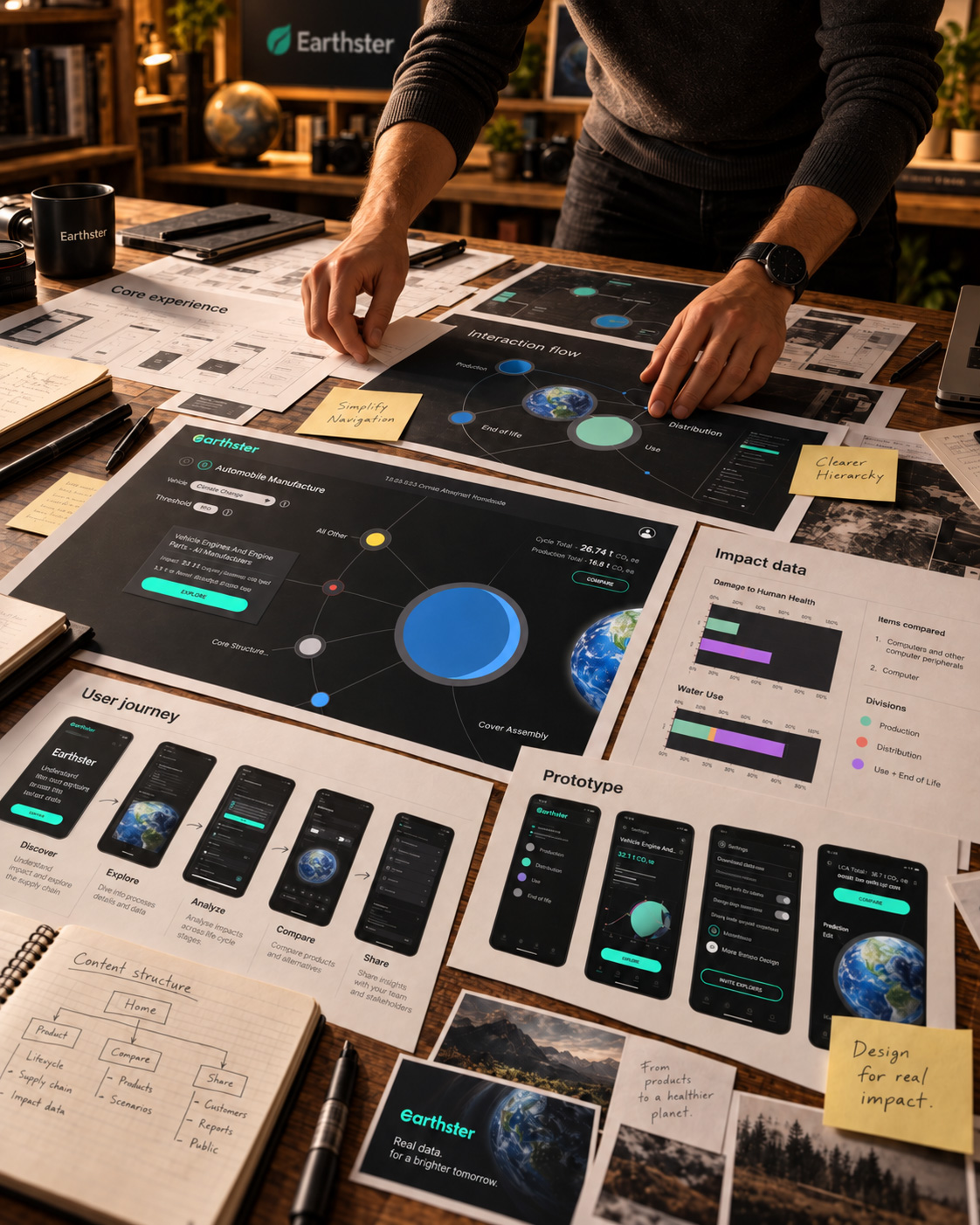
Research, user journeys and information architecture helped us explore how people move from data input to analysis, comparison and collaboration. These findings informed a connected approach to UX strategy, visual identity, prototyping and UI design.
The aim was to establish a clear visual and interaction language that could evolve alongside the platform.
Cohesiveness
We developed a connected brand and product experience spanning visual identity, UX, UI and prototyping.
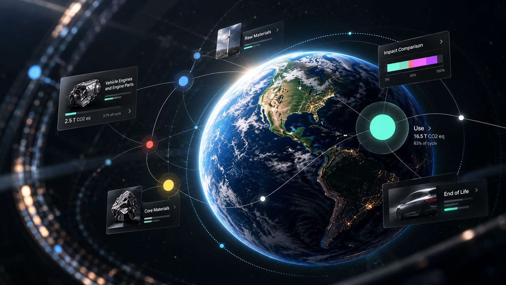
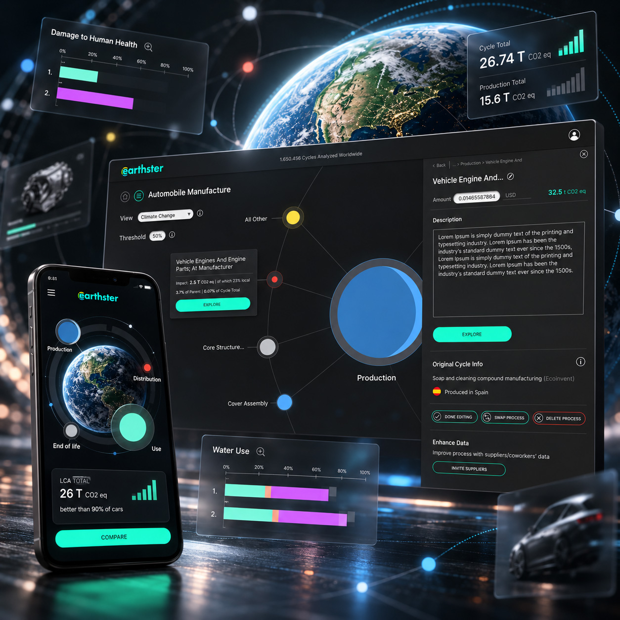
Interactive lifecycle models let users explore individual processes, compare products, identify impact hotspots and incorporate supplier data. The interface brings production, distribution, use and end of life into one connected experience.
A shared design language creates consistency across the application and Earthster’s wider communications.
Making complexity visible
Rather than hiding the relationships within the data, we used connected nodes, scale, hierarchy and colour to help users understand how processes contribute to environmental impact.
This makes the lifecycle model a navigable visual system, helping people move between the overall picture and individual points of detail.
A visual system built around data.
A dark interface gives dense information a consistent backdrop. Stronger colours distinguish actions, lifecycle stages and significant information, directing attention where it is needed.
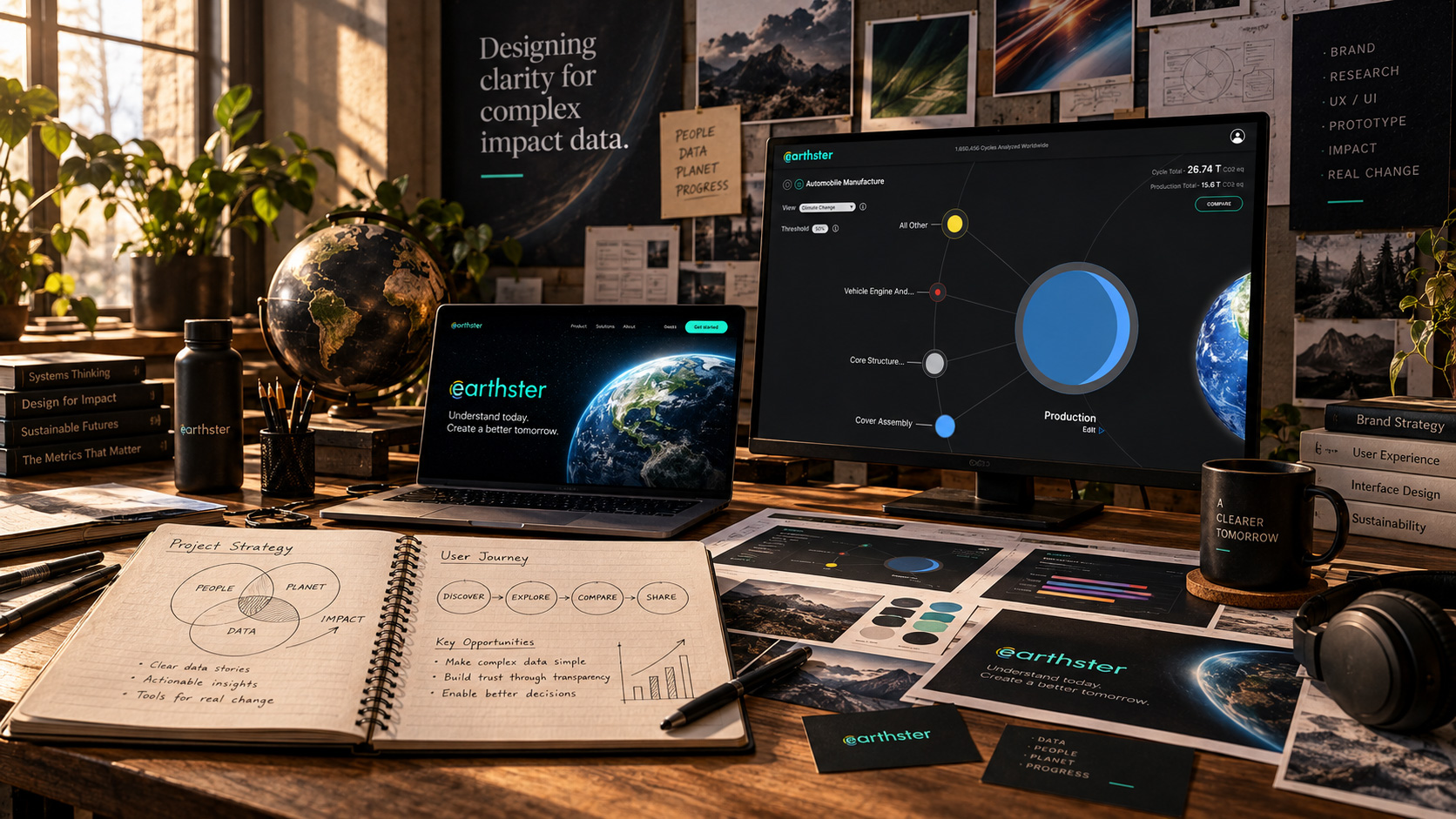
The same principles extend into the brand identity, connecting the product interface with Earthster’s communication materials.
Quick and Easy
The work brought Earthster’s brand and product into a coherent visual and interaction system, designed to make sophisticated environmental analysis quick and easy to navigate.
It established a consistent foundation for presenting lifecycle data and connecting detailed analysis with the decisions producers need to make.