
One event. Many places to connect.
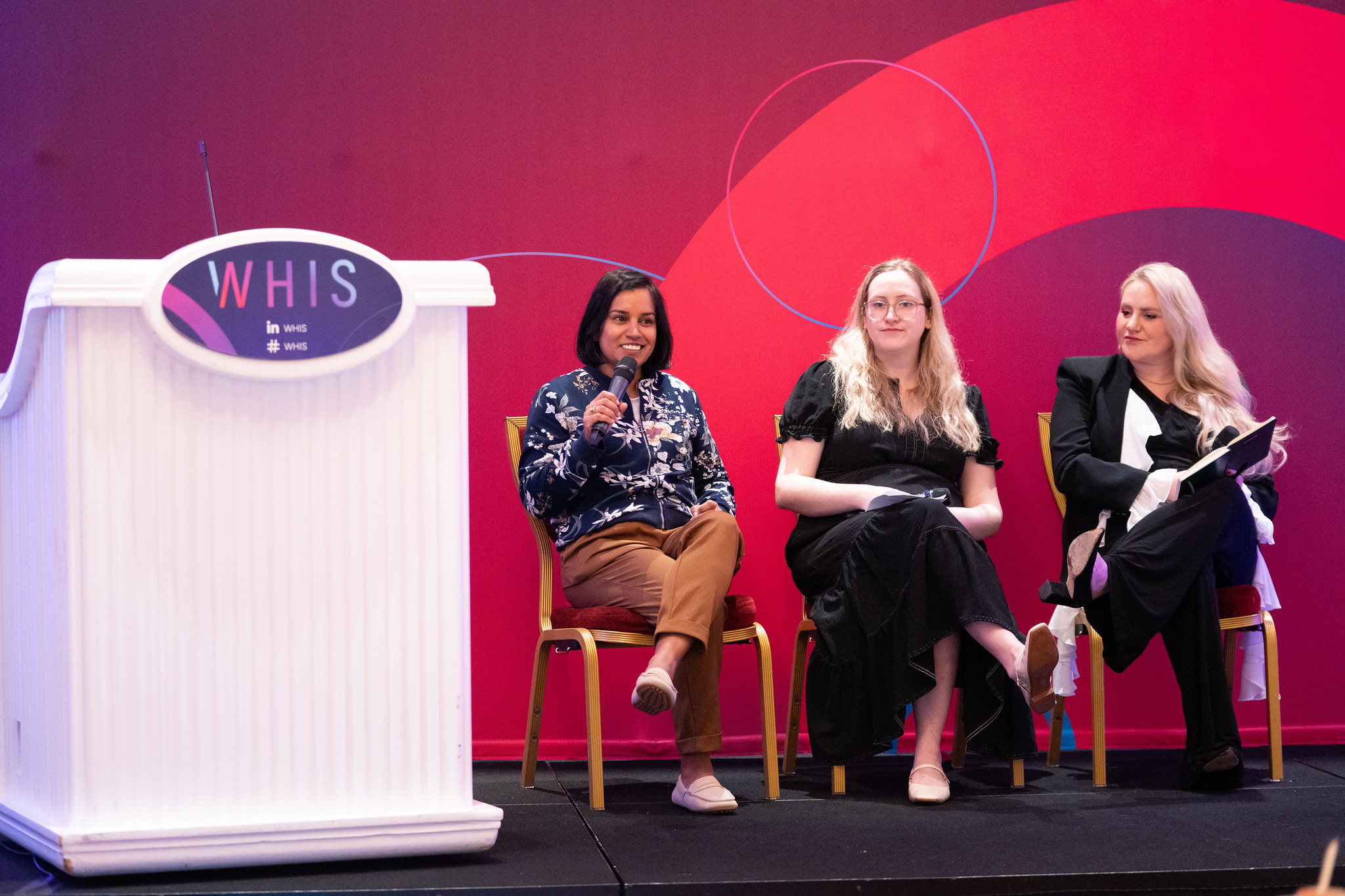
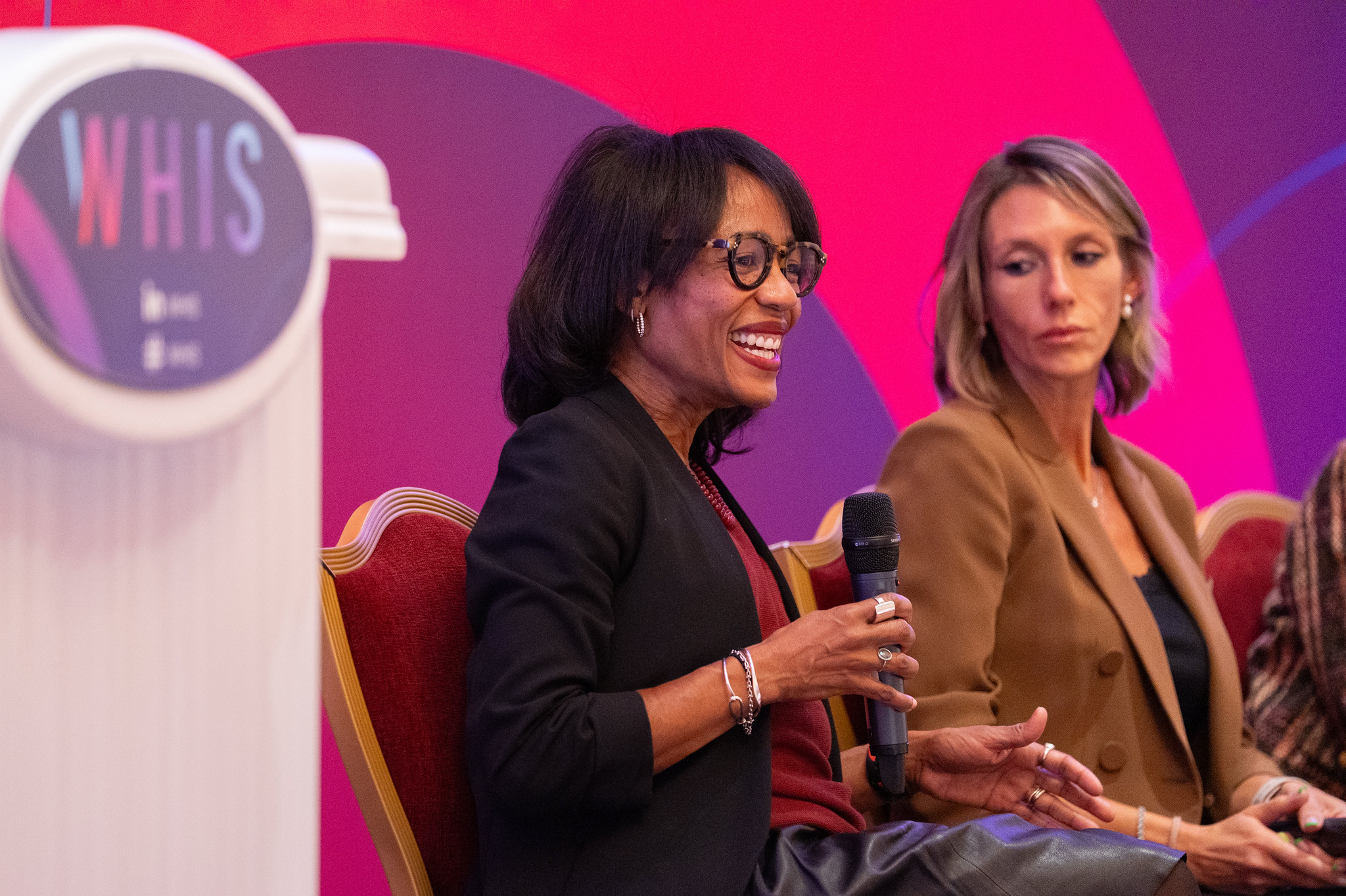
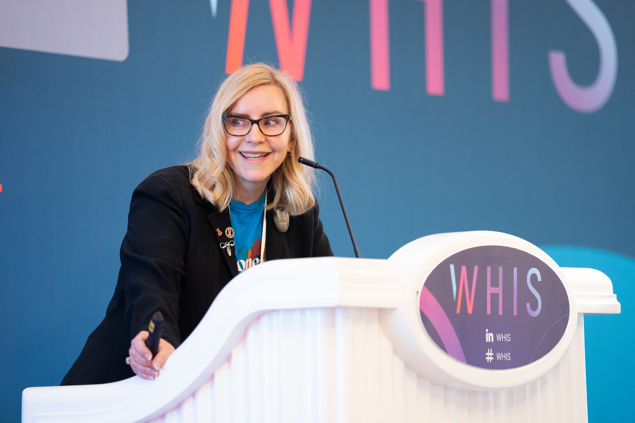
The Women’s Health Innovation Summit brings together people working across women’s healthcare, investment and innovation. Its 2026 US edition took place at Encore Boston Harbor from 13–15 October.
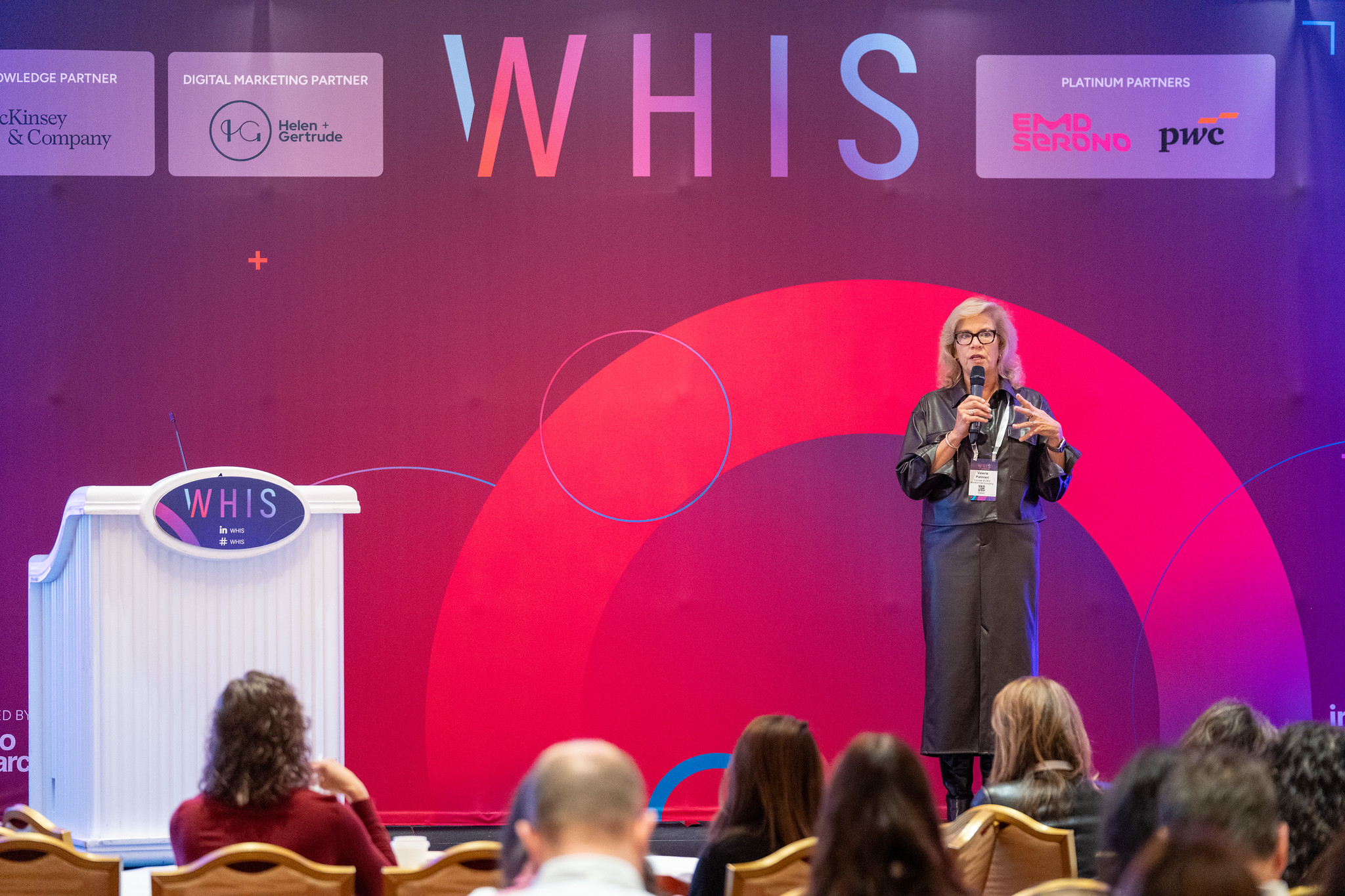
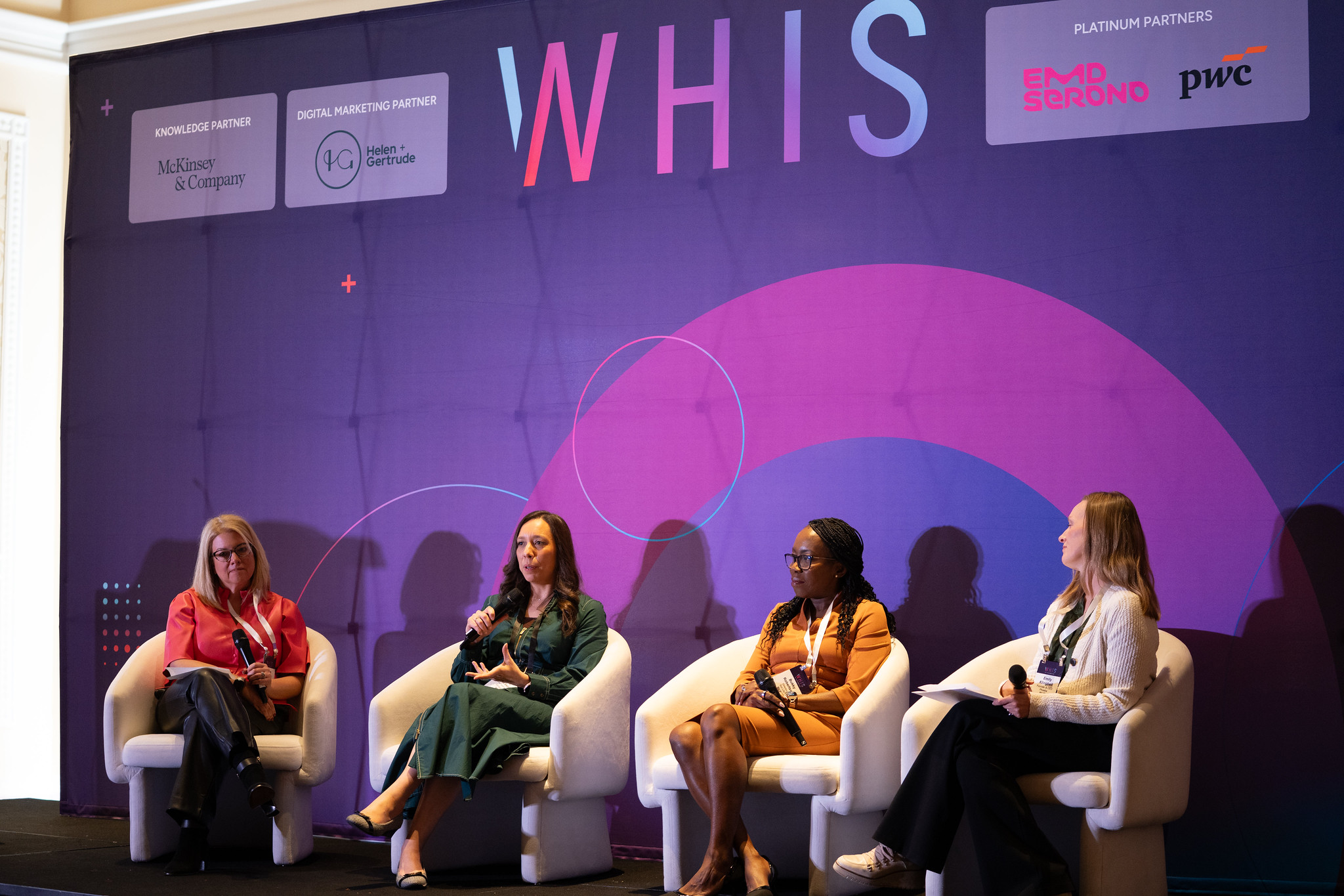
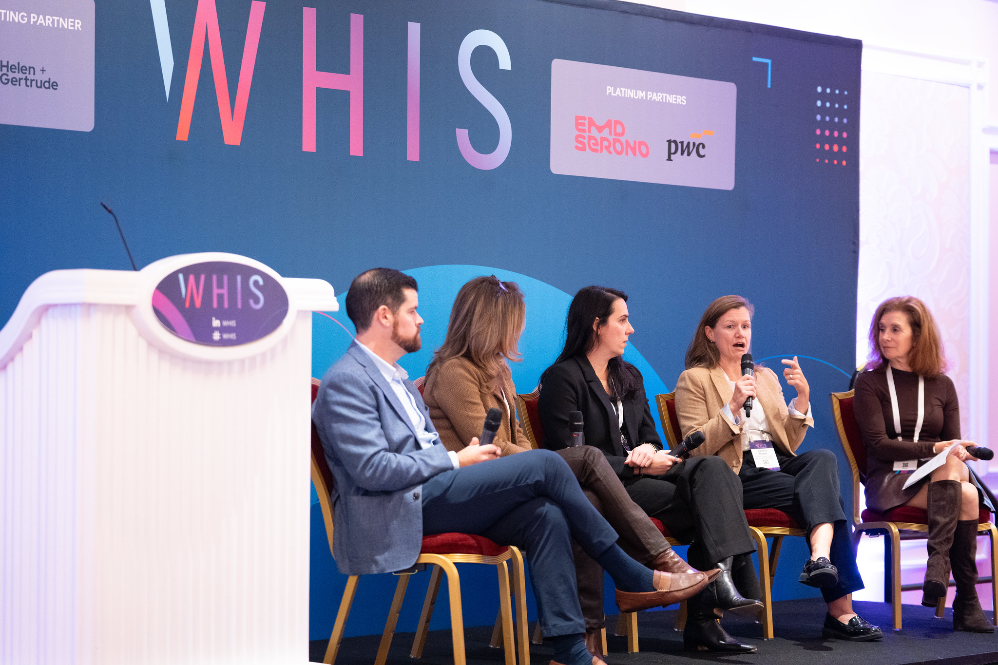
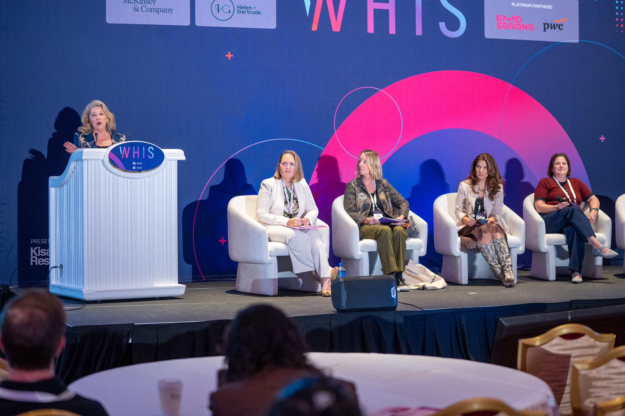
For Kisaco Research, Fábio developed the event’s signage artwork across stages, registration, meeting areas, lounges and exhibition spaces, carrying the existing WHIS identity into the physical attendee experience.
Keep the identity strong and the information clear.
The artwork needed to do different jobs: establish a presence on stage, welcome attendees, identify exhibitors and help people find sessions and facilities.
Each format required its own hierarchy and proportions. The challenge was to retain the energy of the WHIS identity while making practical information easy to find and read.
Direction first. Destination next.
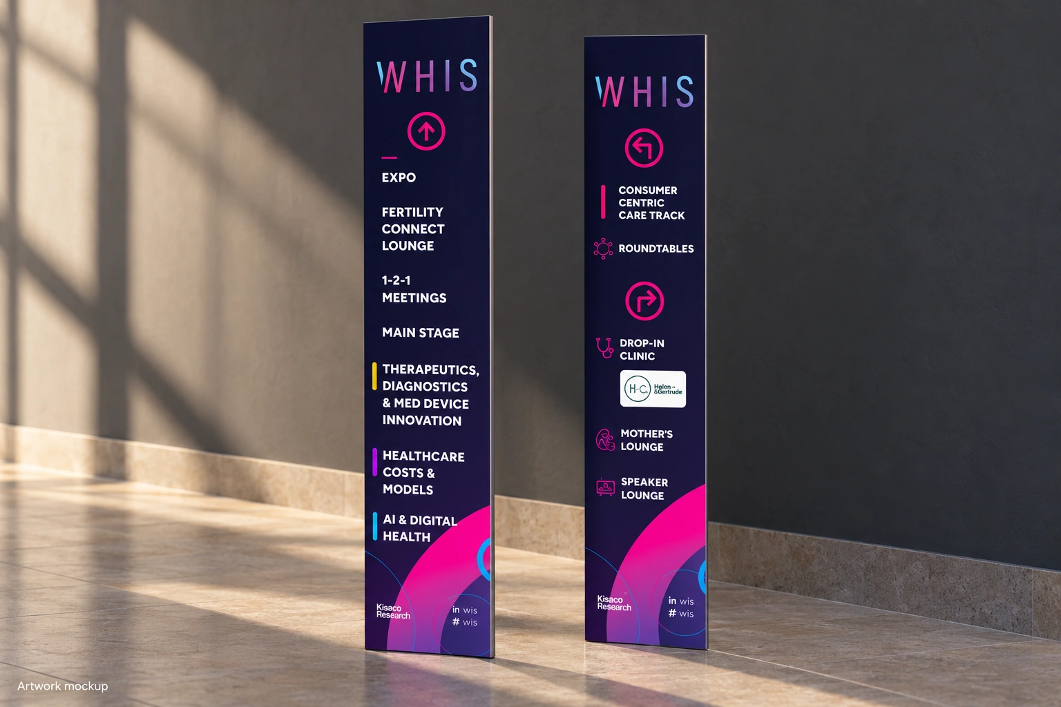
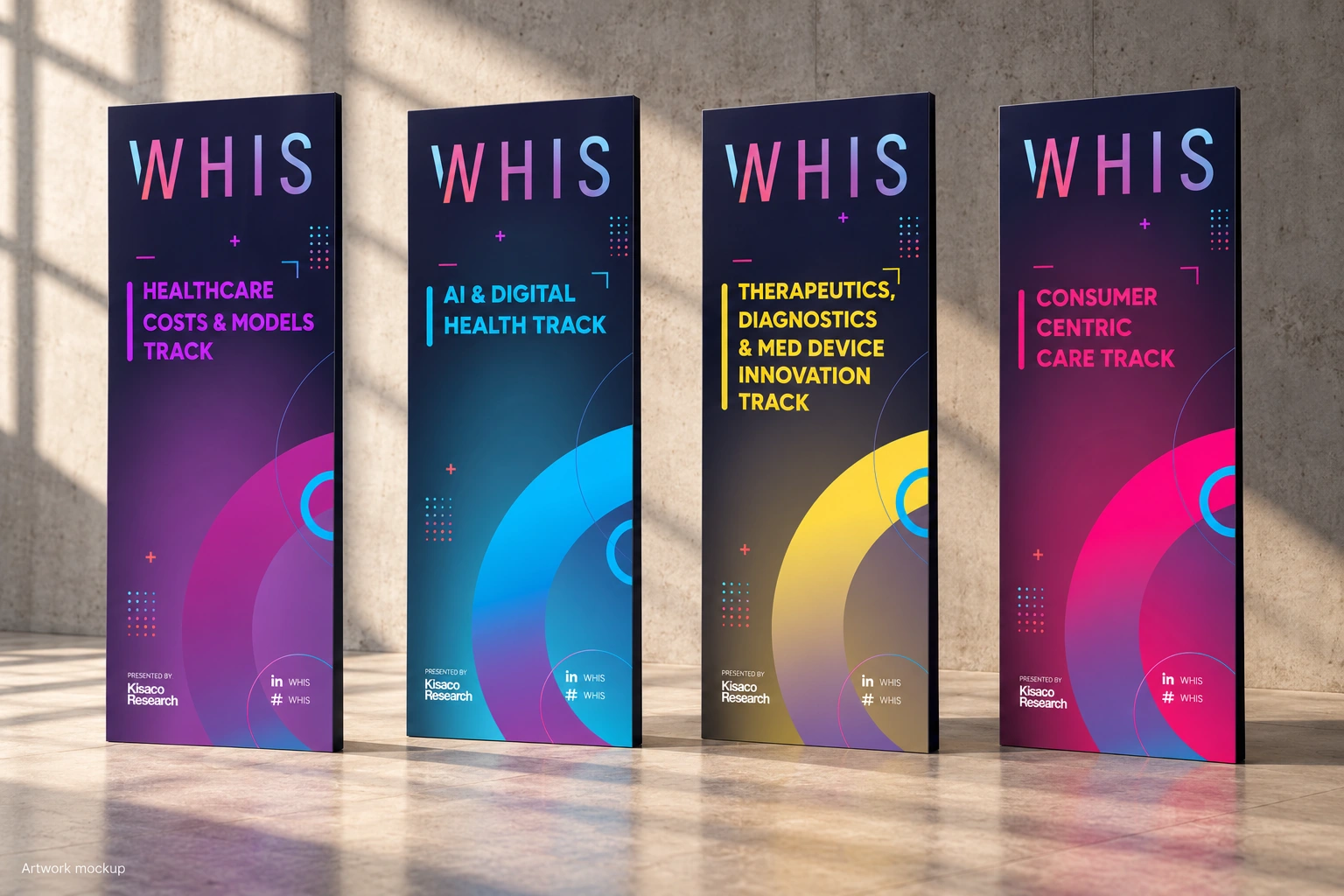
The wayfinding recommendations prioritised a simple hierarchy: direction, destination and track colour. White destination text was proposed for contrast, with coloured markers identifying the content tracks.
The aim was to make the signs quicker to scan, reducing unnecessary visual clutter while retaining the arrows and information people needed to navigate the event.
The track signage carried this colour system across four programme areas, giving each a recognisable place within the wider WHIS visual language.
A connected presence across the venue.
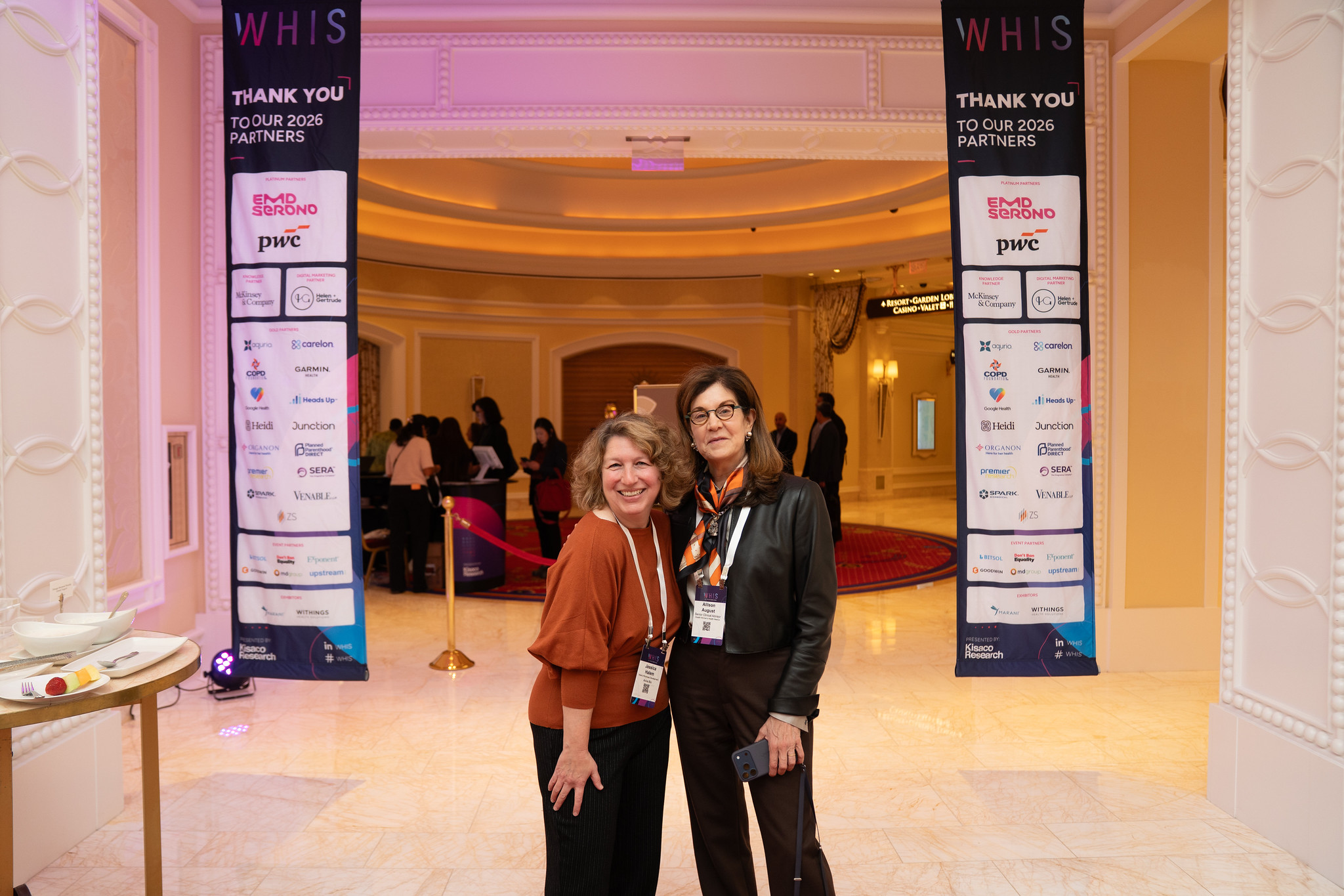
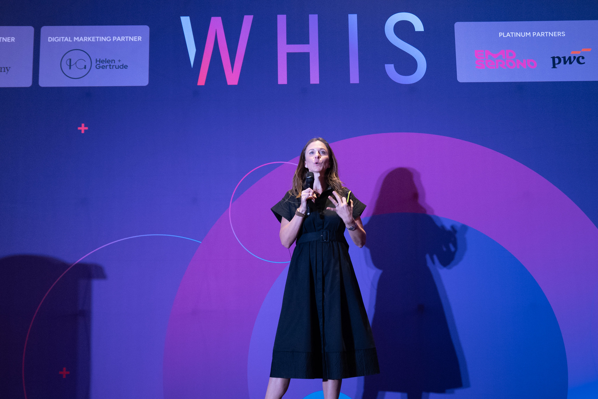
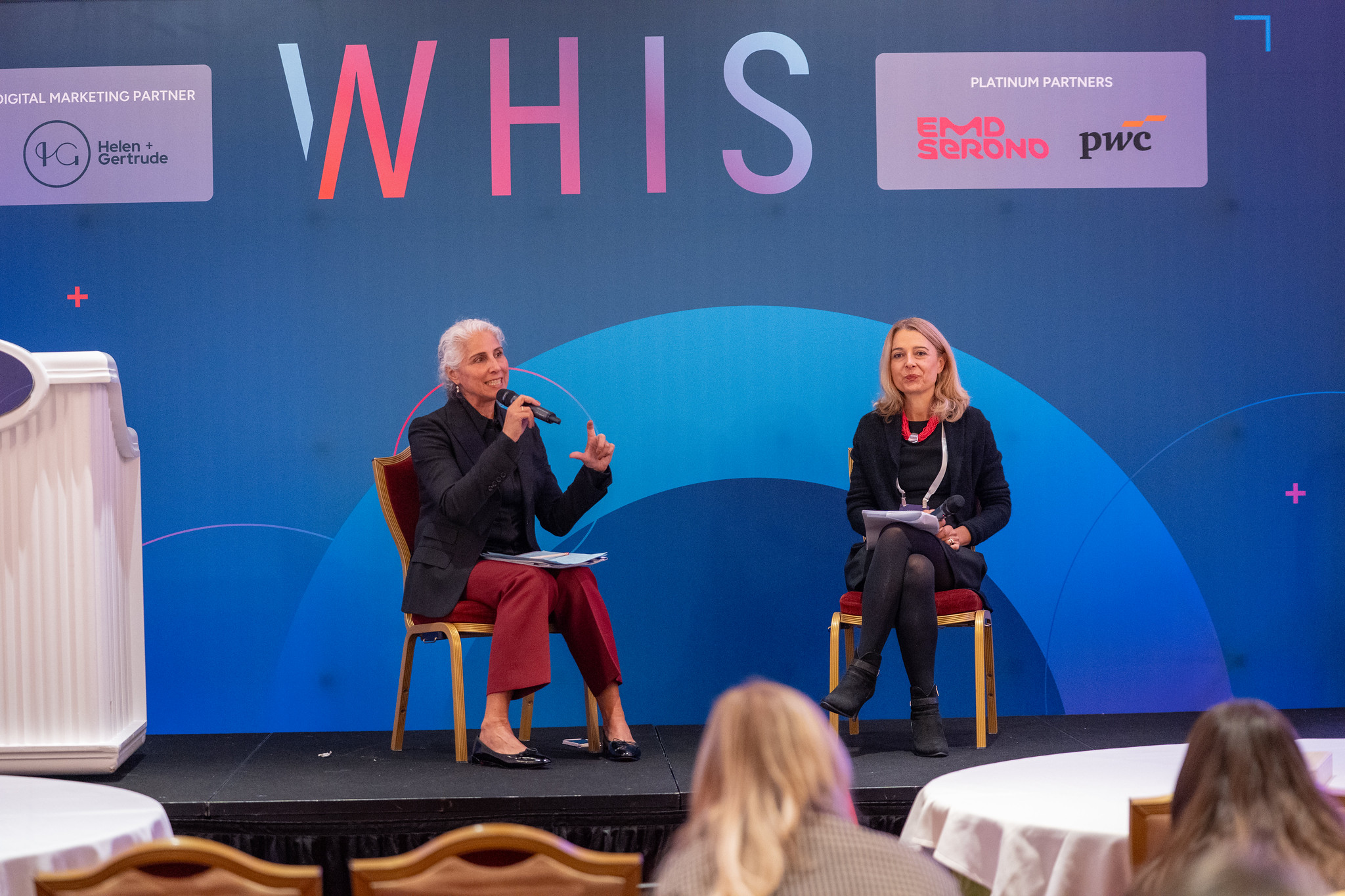
The artwork package extended from stage backdrops and registration desks to sponsor displays, meeting signs, lounge identifiers and start-up stands.
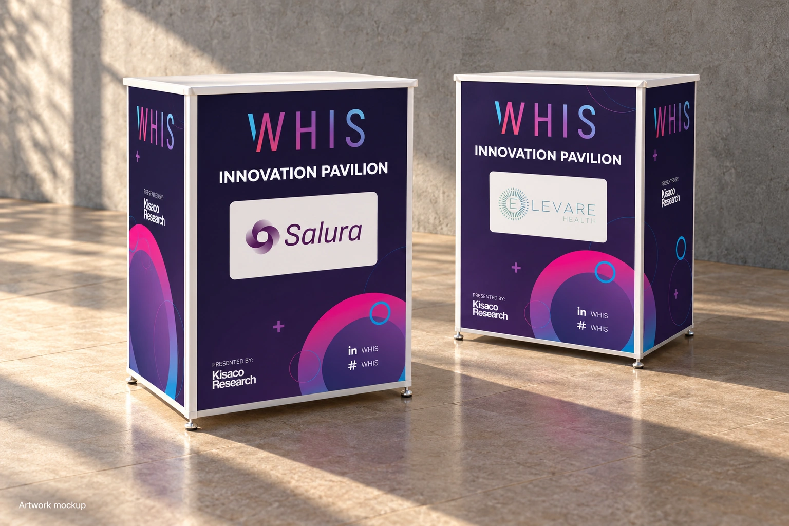
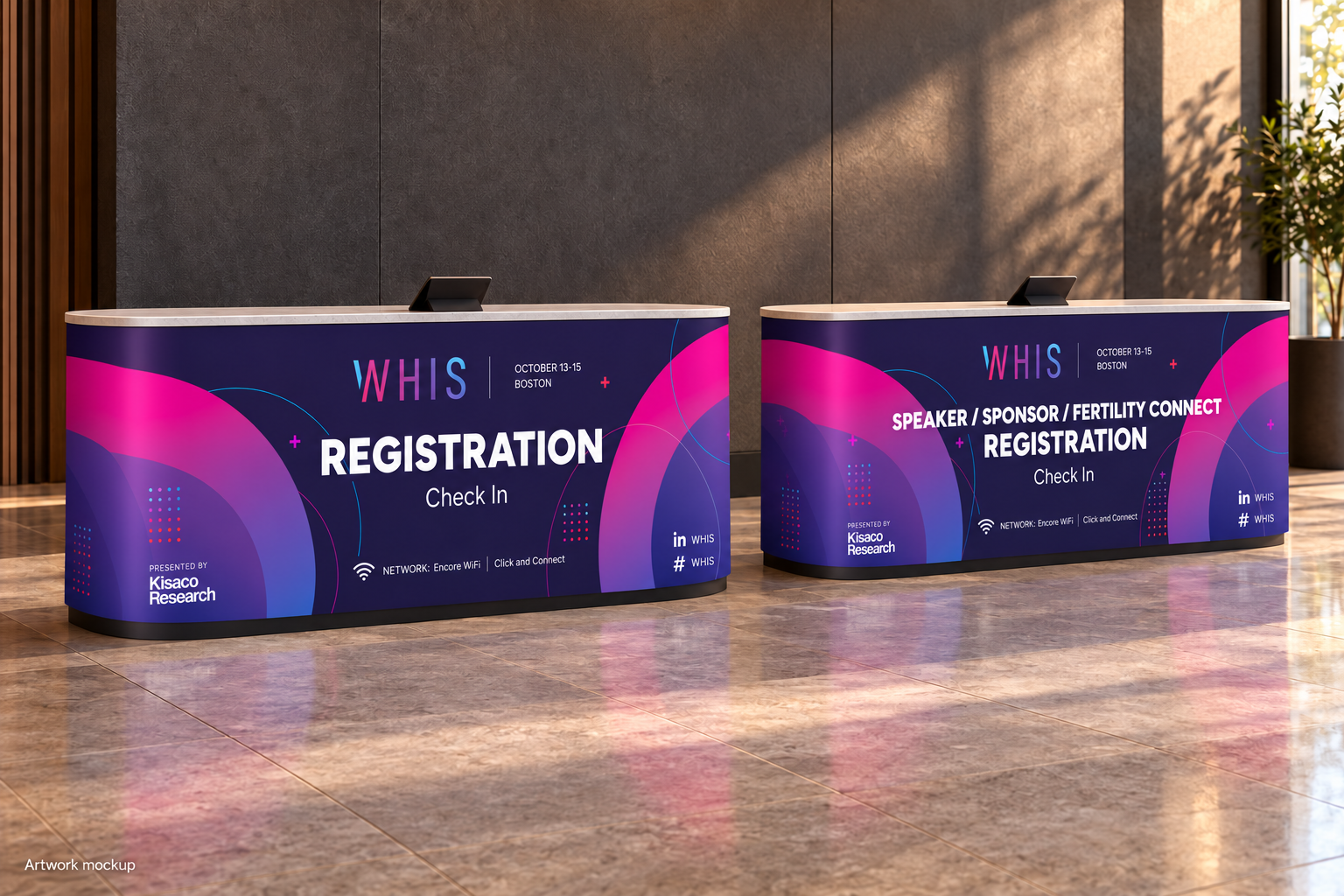
Registration graphics distinguished general check-in from speaker, sponsor and Fertility Connect registration. The Innovation Pavilion stand artwork used a shared layout, giving individual exhibitors visibility within the event identity.
Across the different applications, the gradient WHIS wordmark, ring graphics and dark backgrounds created a consistent visual thread.

Carrying the identity into the smaller details.
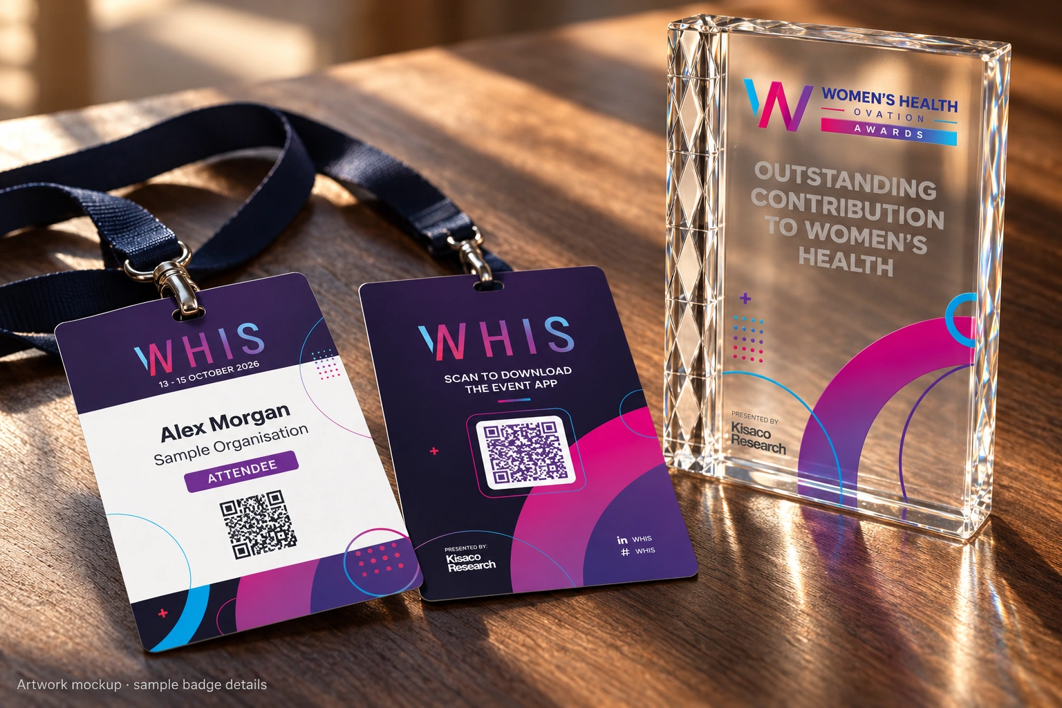
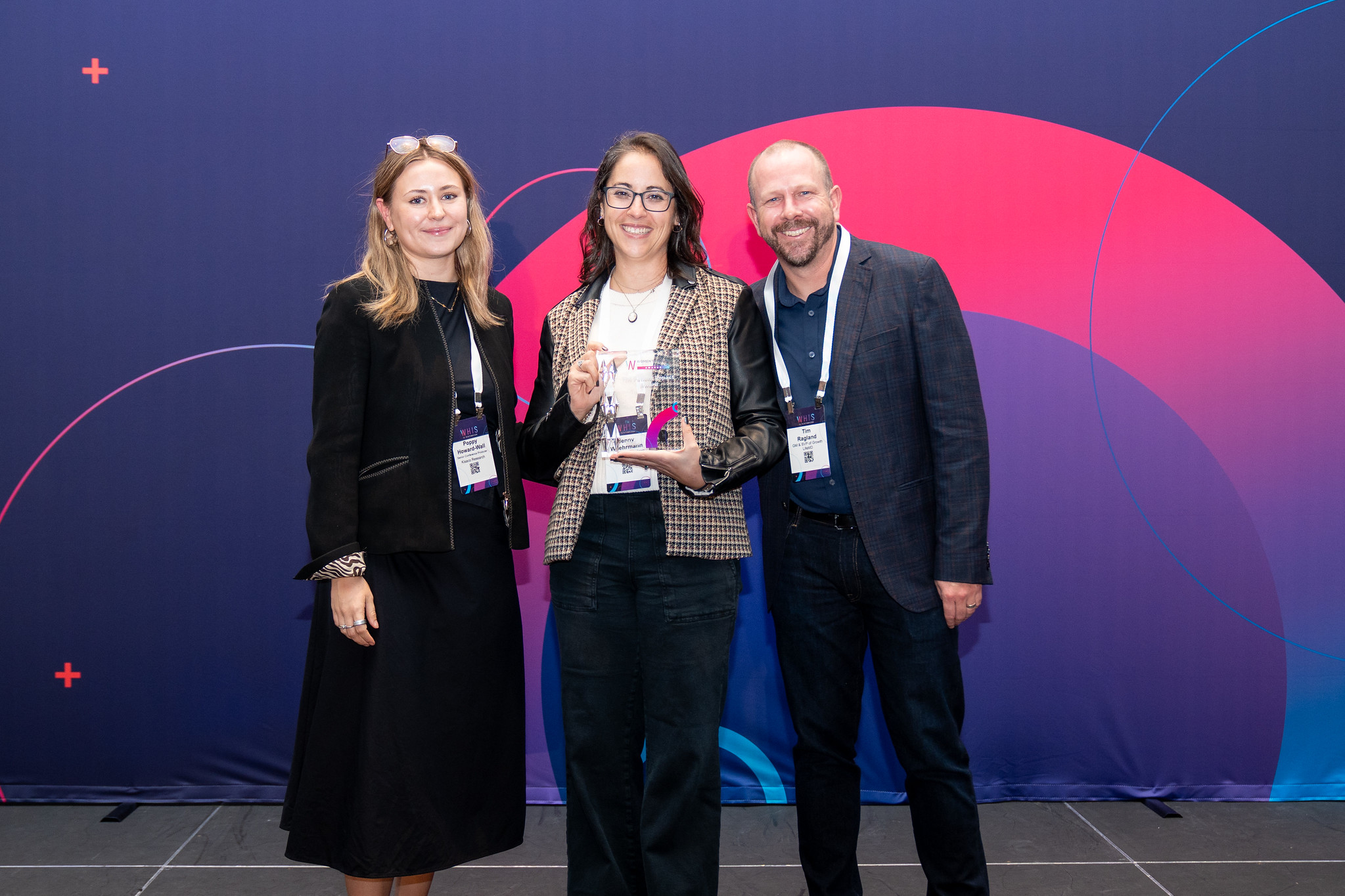
The same visual language extended to attendee badges and award artwork. The badge front kept a clear area for attendee details, while the reverse provided access to the event app.
The production presentation also addressed how the artwork would be reproduced: identifying the CMYK limitations of bright purple and separating printed graphics from engraved text on the awards.
A coordinated artwork package for WHIS USA.
The completed artwork brought the WHIS identity across the event’s large-format graphics, navigation and attendee materials.
The project combined expressive branding with practical information design, providing Kisaco Research with coordinated artwork for a wide range of event applications.